

Fessenden Visual Identity Guidelines
A school’s brand should communicate its story and present a consistent message. Our audiences rely on consistent and effective use of design elements to become familiar with our brand and our story.
The Fessenden School History
During its more than 100-year history, Fessenden’s success has been tethered to the conviction that boys who feel cared for will thrive and succeed. The legacy of our founders’ venture — to educate boys in every aspect of their lives — resonates in the work of our dedicated teachers and staff, who continue to create strong personal connections with their students.
Logo & Wordmark Lockup
The Fessenden School logo is one of the most valuable assets to The Fessenden School brand and it needs to be an instantly recognizable symbol. In order for this to occur, the logo must be used in a correct and consistent manner. There are two versions of the logo and wordmark lockup. The following represents accepted uses for the lockup:
Horizontal Logo & Wordmark Lockup


Single Line Logo & Wordmark Lockup


Stacked Logo & Wordmark Lockup


Stacked Ribbon Logo & Wordmark Lockup


Wordmark
The font used to typeset the Fessenden wordmark is Intrinseca. Use of this font in the branding should be reserved for the wordmark only. Along with the complete logo and wordmark lockup, there are three versions of the wordmark logo. The following represents accepted uses for the wordmark:
Single Line Full Wordmark


Stacked Full Wordmark


Fessenden Wordmark

Shield
Fessenden Shield

Logo Usage
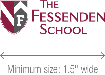
Minimum Size
The minimum size for The Fessenden School logo is 1.5″ wide.
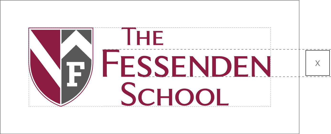
Exclusion Zone
To ensure the preservation of the identity of the logo, it should not appear crowded by any other elements on the page. Please always observe the exclusion zone. The exclusion zone around the logo should be “x” where “x” is equal to the height of the letter F in Fessenden, or a minimum of 0.25″, whichever is greater.
Incorrect Use of the Logo
The logo is one of our most important and valued assets. As such, it is important that it is treated with respect. The different color variations on the logo allow it to be used on various backgrounds. It is important the logo is not altered in any way.
-
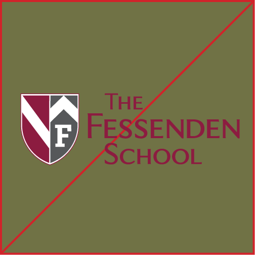
1. Do not use the color version of the logo on any color background. -
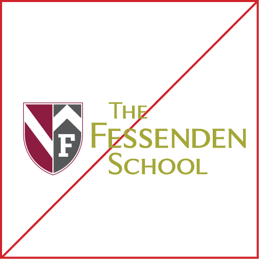
2. Do not alter the colors in the logo. -
3. Do not place the logo in any type of shape. -
4. Do not change the proportions of the logo. -
5. Do not use the white wordmark version of the logo on any light color background. Only use the red logo.
Color
Primary Palette
The Fessenden School logo consists of two main colors: maroon and gray. There are also two additional grays that may be used based on graphic context. Their specific color builds are as follows:
| Pantone | 208 |
| CMYK | 15, 100, 37, 45 |
| RGB | 134, 31, 65 |
| HEX | #861F41 |
| Pantone | 425 |
| CMYK | 48, 29, 29, 76 |
| RGB | 84, 88, 90 |
| HEX | #54585A |
| Pantone | Cool Gray 9 |
| CMYK | 30, 22, 17, 57 |
| RGB | 117, 120, 123 |
| HEX | #75787B |
| Pantone | Cool Gray 7 |
| CMYK | 20, 14, 12, 40 |
| RGB | 151, 153, 155 |
| HEX | #97999B |
Secondary Palette
These colors are used as accents and complement the primary palette. They can be tinted and used for highlighting pull quotes as well as for graphics. Their specific color builds are as follows:
| CMYK | 48, 24, 0, 49 |
| RGB | 77, 103, 133 |
| HEX | #4D6785 |
| CMYK | 36, 25, 71, 1 |
| RGB | 170, 168, 104 |
| HEX | #AAA868 |
| CMYK | 17, 63, 100, 3 |
| RGB | 203, 115, 41 |
| HEX | #CB7329 |
| CMYK | 61, 26, 9, 0 |
| RGB | 100, 160, 200 |
| HEX | #64A0C8 |
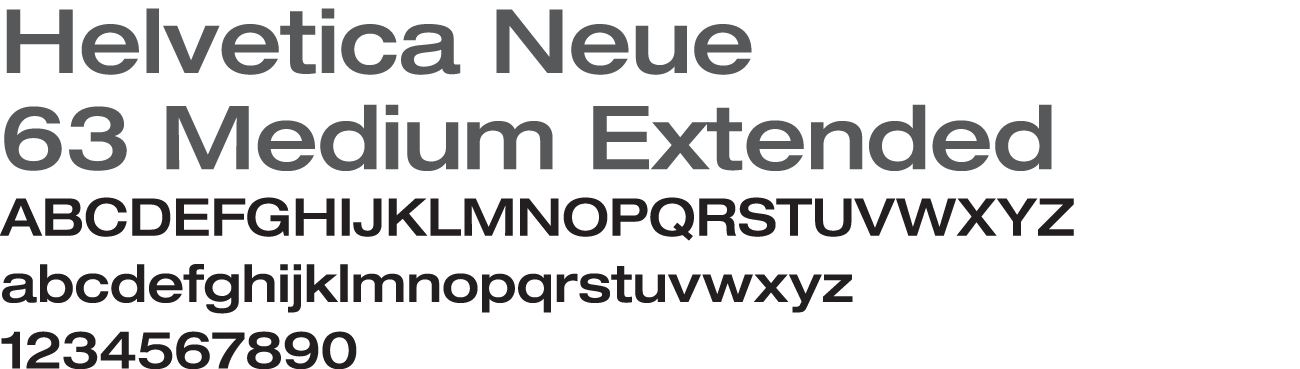
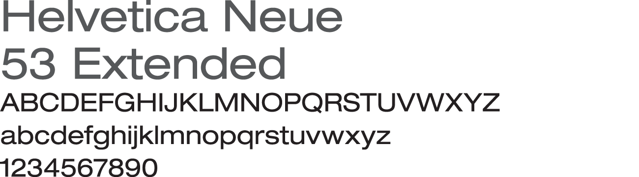
Typography
The typeface used in print and web materials for The Fessenden School are an essential part of the brand. Using the established typefaces is necessary for creating a consistent look and feel that further strengthens the school’s brand and public recognition. The following represents the established typefaces for use in Fessenden School materials:
Typography: Print


Typography: Web


Contact the Communications Department for font files. For additional colors (paint and fabric) as well as collateral samples, please refer to the full Fessenden Visual Identity Guidelines document.
Download Guidelines (PDF)